


E-cig Jetable 20 mg ISOK Mixed Berry (800)
Price range: CHF 9.50 through CHF 59.00 Inc. Vat
Select options
This product has multiple variants. The options may be chosen on the product page
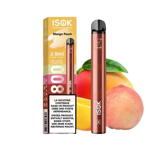
E-cig Jetable 20 mg ISOK Mango Peach (800)
Price range: CHF 9.50 through CHF 59.00 Inc. Vat
Select options
This product has multiple variants. The options may be chosen on the product page
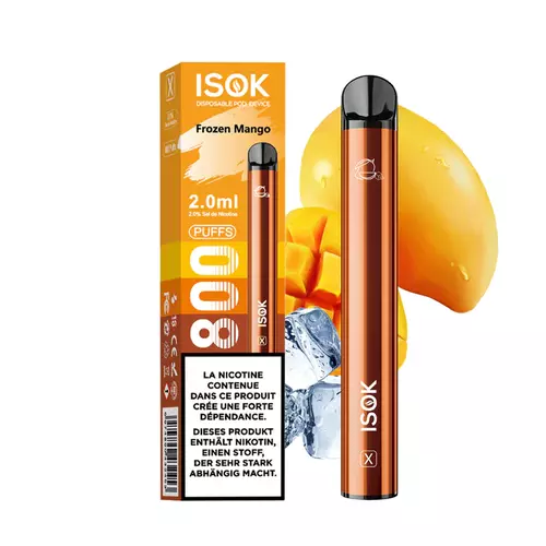
E-cig Jetable 20 mg ISOK Frozen Mango (800)
Price range: CHF 9.50 through CHF 59.00 Inc. Vat
Select options
This product has multiple variants. The options may be chosen on the product page
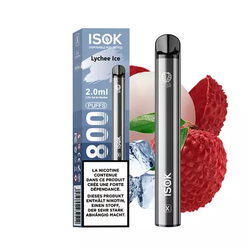
E-cig Jetable 20 mg ISOK Lychee Ice (800)
Price range: CHF 9.50 through CHF 59.00 Inc. Vat
Select options
This product has multiple variants. The options may be chosen on the product page
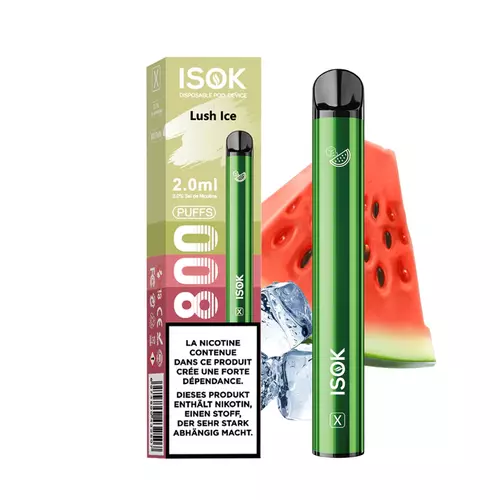
E-cig Jetable 20 mg ISOK Lush Ice (800)
Price range: CHF 9.50 through CHF 59.00 Inc. Vat
Select options
This product has multiple variants. The options may be chosen on the product page
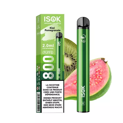
E-cig Jetable 20 mg ISOK Kiwi Pomegranate (800)
Price range: CHF 9.50 through CHF 59.00 Inc. Vat
Select options
This product has multiple variants. The options may be chosen on the product page
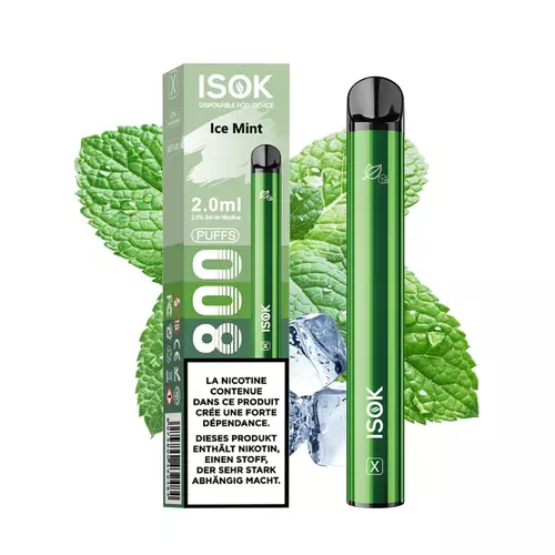
E-cig Jetable 20 mg ISOK Ice Mint (800)
Price range: CHF 9.50 through CHF 59.00 Inc. Vat
Select options
This product has multiple variants. The options may be chosen on the product page

E-cig Jetable 20 mg ISOK Grapey (800)
Price range: CHF 9.50 through CHF 59.00 Inc. Vat
Select options
This product has multiple variants. The options may be chosen on the product page
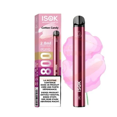
E-cig Jetable 20 mg ISOK Cotton Candy (800)
Price range: CHF 9.50 through CHF 59.00 Inc. Vat
Select options
This product has multiple variants. The options may be chosen on the product page
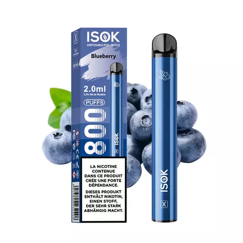
E-cig Jetable 20 mg ISOK Blueberry (800)
Price range: CHF 9.50 through CHF 59.00 Inc. Vat
Select options
This product has multiple variants. The options may be chosen on the product page
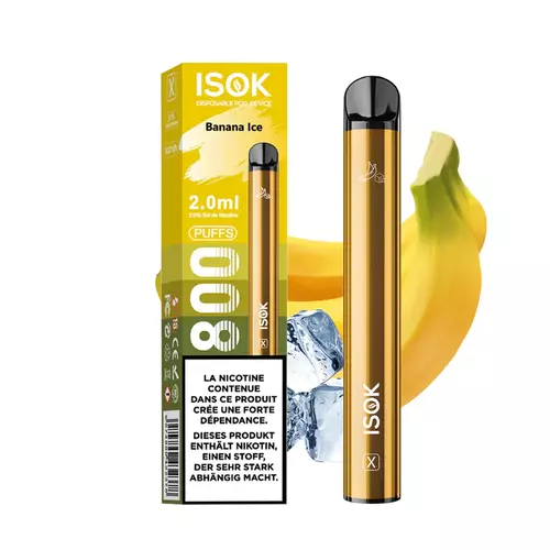
E-cig Jetable 20 mg ISOK Banana Ice (800)
Price range: CHF 9.50 through CHF 59.00 Inc. Vat
Select options
This product has multiple variants. The options may be chosen on the product page
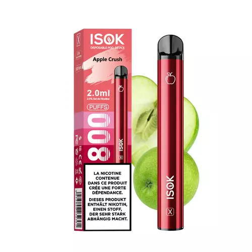
E-cig Jetable 20 mg ISOK Apple Crush (800)
Price range: CHF 9.50 through CHF 59.00 Inc. Vat
Select options
This product has multiple variants. The options may be chosen on the product page
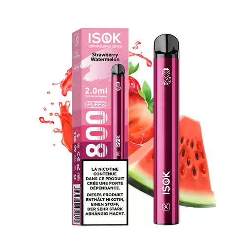
E-cig Jetable 20 mg ISOK Strawberry Watermelon (800)
Price range: CHF 9.50 through CHF 59.00 Inc. Vat
Select options
This product has multiple variants. The options may be chosen on the product page
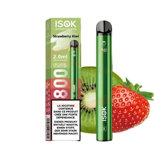
E-cig Jetable 20 mg ISOK Strawberry Kiwi (800)
Price range: CHF 9.50 through CHF 59.00 Inc. Vat
Select options
This product has multiple variants. The options may be chosen on the product page

E-cig Jetable 20 mg ISOK Black Ice (800)
Price range: CHF 9.50 through CHF 59.00 Inc. Vat
Select options
This product has multiple variants. The options may be chosen on the product page
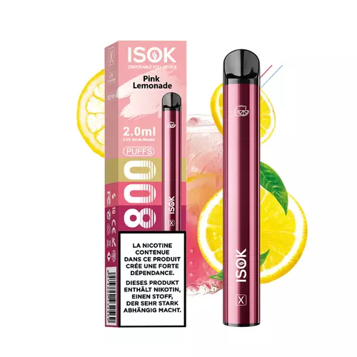
E-cig Jetable 20 mg ISOK Pink Lemonade (800)
Price range: CHF 9.50 through CHF 59.00 Inc. Vat
Select options
This product has multiple variants. The options may be chosen on the product page
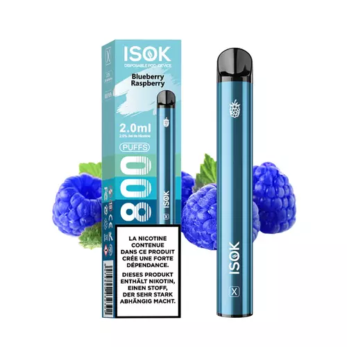
E-cig Jetable 20 mg ISOK Blueberry Raspberry (800)
Price range: CHF 9.50 through CHF 59.00 Inc. Vat
Select options
This product has multiple variants. The options may be chosen on the product page
E-cig Jetable 20 mg ISOK Strawberry Banana (800)
Price range: CHF 9.50 through CHF 59.00 Inc. Vat
Select options
This product has multiple variants. The options may be chosen on the product page